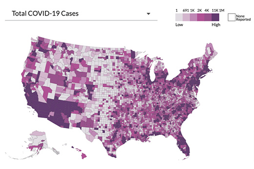
Emory University researchers have enhanced their dynamic national COVID-19 Health Equity Dashboard to provide more localized information on the impact of the pandemic in communities across Georgia.
Georgia currently ranks 19th nationally with respect to COVID-19 deaths per capita, and there is a 10-fold difference in COVID-19 deaths by county across the state.
“Some communities of Georgia have fared much worse than others in this pandemic. County data can help us understand where we might be falling short—and where we are succeeding—in pandemic response,” says Shivani Patel, PhD, MPH, who led a team of students and researchers that developed the dashboard.
“The data can also guide us on which groups need to be engaged to mitigate transmission and severe outcomes within a county, and which background factors may be contributing to disparities in outcomes.”
Visitors to the Georgia Health Equity Dashboard can see, at a county-level, the demographic breakdown of COVID-19 cases and deaths by race, ethnicity, sex and age. They can also view a detailed county-level report with a map of cases by zip code and social determinants information such as poverty, access to health care, health insurance coverage, underlying health conditions and housing issues.
Patel, a social epidemiologist at Emory’s Rollins School of Public Health, points out that there is a need for easy-to-use data about the toll the pandemic is taking at a more granular level. She hopes county health officials and state policy makers can use the data to be more responsive to ground realities.
On the Georgia Health Equity Dashboard homepage, users can see a snapshot of COVID-19 deaths across the state, including statewide demographics of cases and deaths and county-level visualizations of social determinants.
Drilling down, users can select a county to see how it compares to the rest of the state in average daily cases and deaths, and in social characteristics, such as percentage of residents who are African American, percentage who live in poverty, urbanization level, percentage who have co-morbid conditions such as diabetes and more. The dashboard will be enhanced with additional metrics like vaccination status as the data become available.
The national health equity dashboard launched last June soon after the pandemic began in the United States to fill in the gaps about the interplay between health outcomes and underlying social determinants and other vulnerabilities, including underlying medical conditions.

