The Rollins School of Public Health at Emory University has launched a new climate and health indicator dashboard that provides data on the impact that climate change is having on human health in Georgia.
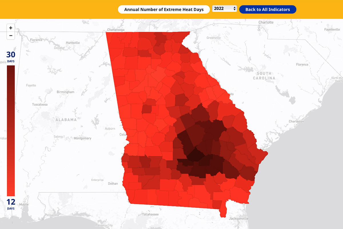
The mobile-friendly dashboard provides data spanning decades on numerous indicators of climate-related hazards—such as annual totals for extreme heat days, air pollution, and drought—for each of Georgia’s 159 counties. It is the only publicly available interactive dashboard that provides both public health and climate-related data on a county-by-county level across Georgia.
“This is part of Emory’s commitment to our community to address the issue of climate change. It is designed to communicate the risks in Georgia—particularly the impact on public health—and how people in Georgia experience climate change,” says Yang Liu, PhD, chair of the Gangarosa Department of Environmental Health at Emory’s Rollins School of Public Health.
The Southeast, and Georgia specifically, is increasingly vulnerable to climate change, experiencing more extreme heat days and related negative health outcomes.
The dashboard also provides decades of county-level trends for at-risk populations of Georgians, including:
- percentage of populations living in poverty,
- percentage living with disabilities,
- county health rankings,
- and overall percentile vulnerability rank
“This dashboard shows that climate change is happening, it is affecting Georgia communities, and we need to take action. The dashboard empowers policymakers, government agencies, media, and community groups with the information they need to promote climate and public health measures backed by scientific evidence,” Liu says.
The dashboard is funded through the Emory Climate Research Initiative (ECRI), which provides leadership in climate and health research, education, and solutions in response to climate change.
“Action is driven by data and the ability to visualize data. It is exciting that this dashboard will further enable scientific-based action to help prevent and mitigate health consequences of our changing environment,” says Daniele Fallin, PhD, dean of Emory University’s Rollins School of Public Health.
Dashboard users can:
- Download county-level data across years and indicators
- Export trend graphs by county
- Share and download indicator maps
The dashboard and Climate & Health Actionable Research and Translation Center (CHART) are integral pieces of the climate change and health research at the Rollins School of Public Health. CHART researchers study the impacts of climate on health—with a focus on health-related illness in Atlanta and examining factors that may lead to disparities in illness outcomes—to help develop action-oriented strategies to protect the health of individuals and communities.