
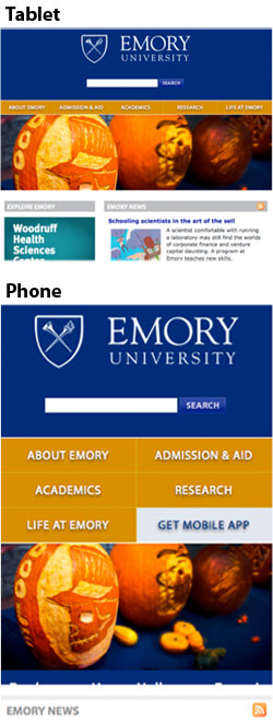
Responsive design is an approach to web design where the width of a device — whether a smartphone, desktop computer or iPad — determines the view of a website, with a minimum of resizing, panning and scrolling.
Emory is only the sixth top 25 national university to implement a responsive redesign for its entire site.
"Our main website introduces millions of people around the world to Emory, so it's important for the site to present Emory as one of the top universities in the United States," says Vice President of Communications and Marketing Ron Sauder.
"Increasingly, that introduction is happening on a mobile device instead of a desktop computer."
With 20 million page views and 5 million visitors to emory.edu, adds Jan Gleason, executive director of University Marketing, "presenting Emory online in a contemporary, mobile-friendly way is just essential."
The 18-month project, largely an in-house effort of Emory's Office of Communications & Marketing, was a response to the growth of mobile and social media.
One out of 10 visits to www.emory.edu is from a mobile device, notes Gleason. "It's all about the small screen, and about how people interact with each other and with organizations online."
Designed to support recent versions of common browsers that account for 95 percent of all visits, and still be usable for the remainder, emory.edu's responsive design fits small screen devices, like phones, held in landscape or portrait mode; the iPad, held in landscape or portrait mode; smaller tablets held in portrait mode; and laptop, netbook and desktop displays.
Key to the new responsive design is a prominent search box to make mobile browsing easier.
And every aspect, down to the size of the buttons designed to fit fingertips, was carefully considered.
"It's not just how a website looks or how it's organized, but also how it works on the device that you are using," says John Mills, executive web producer. "It's about the experience."
Transforming Emory's homepage into a responsive design required a ground-up rebuild of the entire site in Cascade, Emory's content management system, and other improvements.
Typekit fonts were added to refresh the design, and page layouts were redesigned to lighten and brighten the pages. Content updates included the creation of "highlight boxes" to promote Emory's strengths and attributes, and "verb boxes" to display strategic content.
Following an "iterative design" strategy, the project team based all of the changes on data, with a goal of maximizing the site's appeal and effectiveness for key audiences, as well as making best use of team resources by focusing time on identified priorities.
"I'm really proud of the focus and speed with which we have responded to the growth of mobile and of the talented staff in University Marketing, the Emory Creative Group, and Emory Photo/Video who led and contributed to the project," says Sauder.
"We were able to develop this project by reallocating existing resources to fund the work of our web maintenance contractor, StoneRidge, and we have continued to benefit from our greater collaborators and partners in UTS [University Technology Services] and OIT [Office of Information Technology]."
Since the launch of the University’s web redesign in 2008, Emory has worked to align its overall web presence by providing schools and units with a "standard template," now used by more than 250 websites across the University.
Responsive design will be available for standard templates in 2013. Schools and units that currently have standard template sites may choose to adopt the new version, or stay in the current version. Emory's Office of Information Technology Web Design Group provides support for schools and units to migrate into version 2 of the standard template.